Clarity, with
a little more life.
A confident identity for the people keeping the web running. Built to connect the website, the product and the work you show your clients.
Turn monitoring into
customer confidence.
The customer is buying fewer unpleasant surprises and a clearer response when something goes wrong.
| Layer | Message | Role |
|---|---|---|
| Core promise | Know before your customers do. | Landing page, campaigns, sales opening. |
| Supporting idea | Keep their business moving. | Reports, partner materials, brand sign-off. |
| Team outcome | Less time connecting scattered signals. | Show the incident and its context. |
| Agency outcome | Make proactive care visible to your clients. | Branded portal, status page and report. |
| Product proof | Connected checks, second-region verification, customer status. | Follow the problem with concrete evidence. |
Human, then technical.
Start with the awkward customer email or the untrusted alert. Introduce the check type when it helps explain the solution.
Specific, never absolute.
Say “helps reduce false alarms”, not “zero false alarms”. Explain what the system observes, verifies and communicates.
Calm, with momentum.
Short headlines. Plain explanations. One clear next action. Use mint to add energy without turning everything into a notification.
Hoppla.
One name. One full stop.
The wordmark is the default for navigation and UI. The rising signal is a supporting mark for covers, app icons and larger brand moments.








Give it room.
Clear space: at least half the height of the capital H on every side. Minimum wordmark width: 88 px on screen or 24 mm in print.
Keep the dot.
Use “Hoppla.” for the visible logo; “hoppla.dev” is the address. The signature has one coloured dot, at the end of the name. Do not add another after the symbol.
Choose the right version.
Blue dot on white, mint dot on navy. For one-colour printing, use the navy or white one-colour version. Never stretch, rotate or add glow to the logo.
Do
- Use the supplied files as they are.
- Keep half the height of the H clear on every side.
- Put the blue-dot version on white or cloud, the mint-dot version on midnight.
- Write “Hoppla.” in the logo and “hoppla.dev” for the address.
Don’t
- Stretch, rotate or recolour the logo.
- Add glow, shadows or other effects.
- Add a second dot, for example after the symbol.
- Retype the wordmark in a font; use the outlined artwork.
Every version
| Version | Use on | Files |
|---|---|---|
| Wordmark, primaryWhite and cloud | White and cloud | SVG PNG 2400 × 769 px |
| Wordmark, reversedMidnight | Midnight | SVG PNG 2400 × 769 px |
| Wordmark, one colour, navyOne-colour print on light | One-colour print on light | SVG PNG 2400 × 769 px |
| Wordmark, one colour, whiteOne-colour print on dark | One-colour print on dark | SVG PNG 2400 × 769 px |
| Signature, primaryWhite and cloud | White and cloud | SVG PNG 2400 × 638 px |
| Signature, reversedMidnight | Midnight | SVG PNG 2400 × 638 px |
| Signature, one colour, navyOne-colour print on light | One-colour print on light | SVG PNG 2400 × 638 px |
| Signature, one colour, whiteOne-colour print on dark | One-colour print on dark | SVG PNG 2400 × 638 px |
| App symbolApp icons, avatars, favicons | App icons, avatars, favicons | SVG PNG 1024 × 1024 px |










All logo lettering is outlined vector artwork, so the SVG files need no font installation. PNG files have transparent backgrounds.
Quiet structure.
Bright punctuation.
- Midnight
#071F2DTrust / 60% - Cloud
#F2F6F7Space / 25% - Mint
#35F2C3Energy / 10% - Electric
#246BFEAction / 5% - White
#FFFFFFReading surface
Display / Hoppla Sans Bold
Compact, confident headlines. Web: 48–96 px. Print cover: 38–52 pt. Tracking: −0.04 em; line height: 1.04.
Body / Hoppla Sans Regular
Web: 17–20 px; line height: 1.5. Reports: 10.5–12 pt; line height: 1.45. Use short paragraphs with visible space between them.
Data / tabular rhythm
Right-align quantities; label units and dates. Use monospace sparingly for timestamps and identifiers. Never turn body copy into tiny technical captions.
| Use | Foreground / background | Rule |
|---|---|---|
| Primary reading | Midnight on white or cloud | Default text and report tables. |
| Expressive surfaces | White and mint on midnight | Hero, cover, closing campaign. |
| Calls to action | Midnight on mint | Use dark labels. White on mint is too faint. |
| Brand link colour | Electric on white | Underline text links; never rely on hue alone. |
| Operational states | Green #087C59 / amber #985200 / red #B33340 | Use a written label or icon with colour. Keep independent of tenant branding. |
Hoppla Sans is TeX Gyre Heros by the GUST e-foundry, the free edition of URW’s Nimbus Sans, adapted and self-hosted with the site. Anyone may use and share it under the GUST Font License: licence and changes and original font. Colour percentages describe a starting composition, not a rigid quota.
Connected. Protected.
Cared for.
Images are metaphors for the service people rely on, not product screenshots.
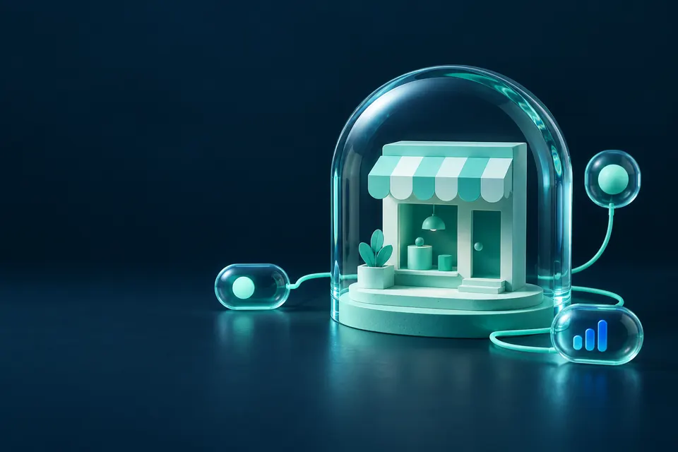
Photography & illustration
Use tactile, architectural metaphors for digital services: connected, protected, cared for. Keep one focal point and generous negative space. Avoid generic shields, robots and holographic dashboards.
The rising signal
Three rounded bars create a recognisable rhythm. Use them once per composition: a cover accent, a section marker or a cropped background. Never use decorative bars as if they were real performance data.
Proof belongs next.
Follow the promise with a real product demonstration or verified customer evidence. Sample data is labelled. No invented testimonials, customer logos or savings claims.
Writing about
Hoppla?
For interviews, background or brand questions, reach us through the contact details in our imprint.
Contact details (Imprint)About Hoppla
Hoppla is a website monitoring platform from Münster, Germany. It brings monitoring, verified alerts and branded status pages together for teams, agencies and hosters. Hoppla is hosted in the EU and is currently in early access.
- Name
- Hoppla (the logo is written “Hoppla.”)
- Based in
- Münster, Germany
- Hosting
- EU: Germany and Finland
- Website
- hoppla.dev